Portfolio

Selected Marketing and Project Work

Each project below is presented as a case study: the objective, my role, how the work was coordinated, and what it produced.

Clean Spaces Coastal primary logo with watercolor cleaning bucket and florals
Primary logo lockup with the tagline 'Natural care. Sparkling results.'
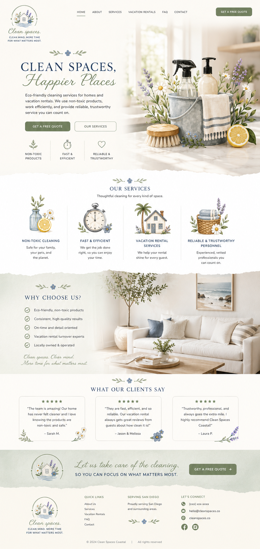
Clean Spaces Coastal website homepage design
Website design: hero quote request, four service pillars, why-choose-us proof, and client testimonials.
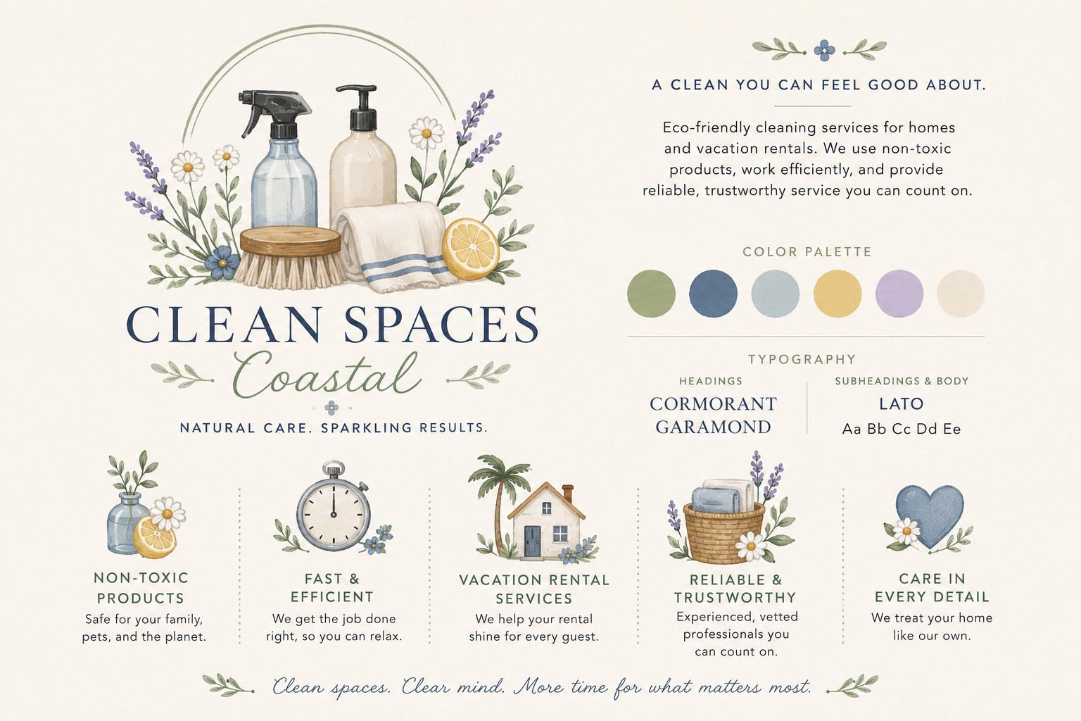
Clean Spaces Coastal brand sheet with palette, typography, and service icons
Brand sheet: palette, Cormorant Garamond and Lato typography, and the service-pillar icon set.
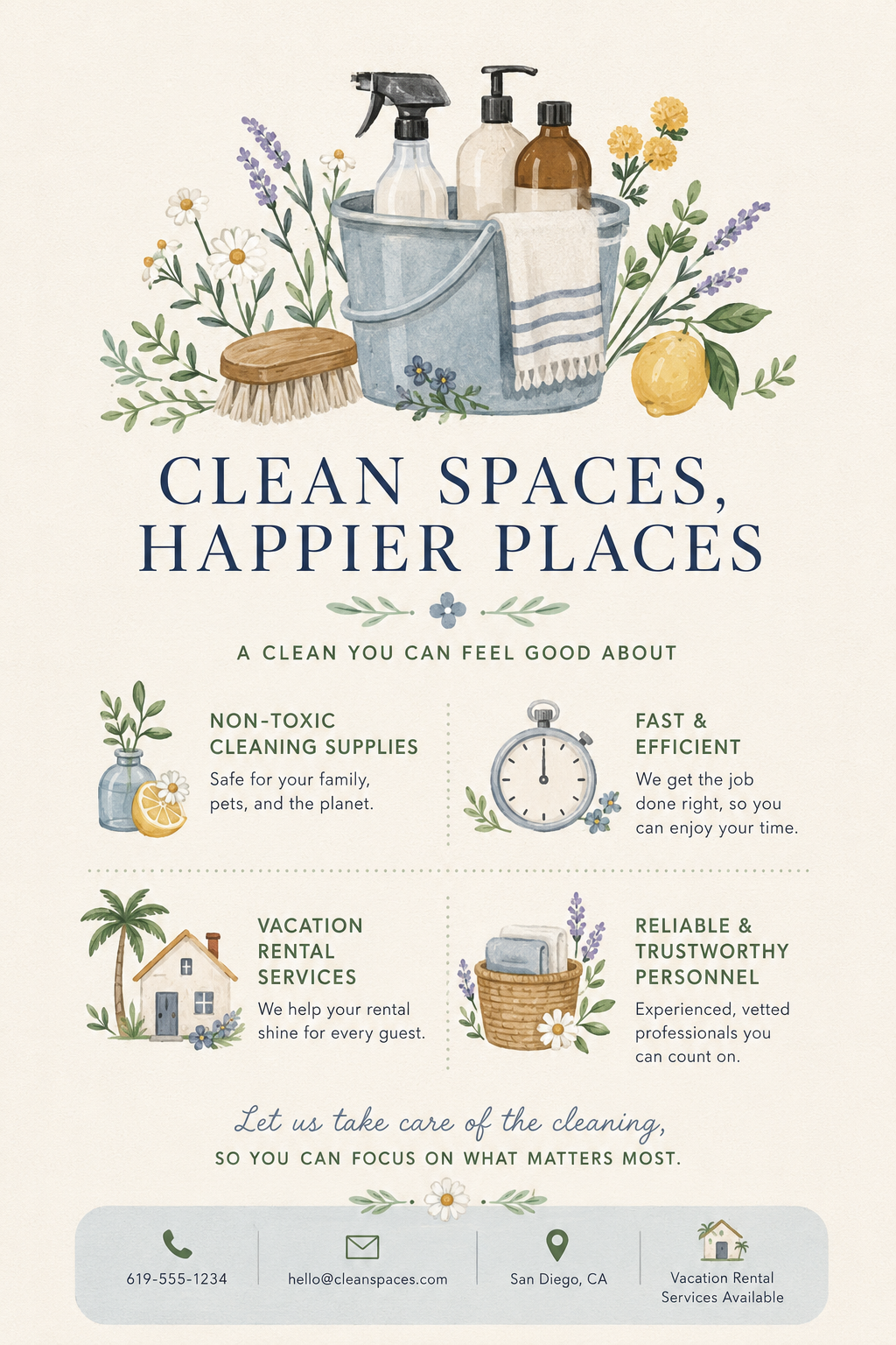
Clean Spaces Coastal flyer with service highlights and contact details
Flyer leading with 'Clean spaces, happier places' and the four service pillars.
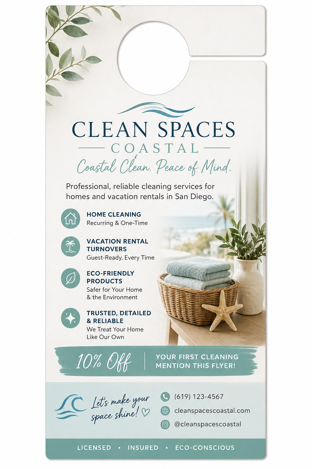
Clean Spaces Coastal door hanger with 10 percent off offer
Door hanger for local canvassing, with a first-cleaning offer and vacation rental callout.
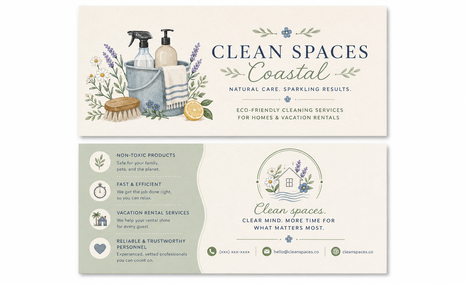
Clean Spaces Coastal double-sided business card
Double-sided business card pairing the lockup with service benefits and contact details.
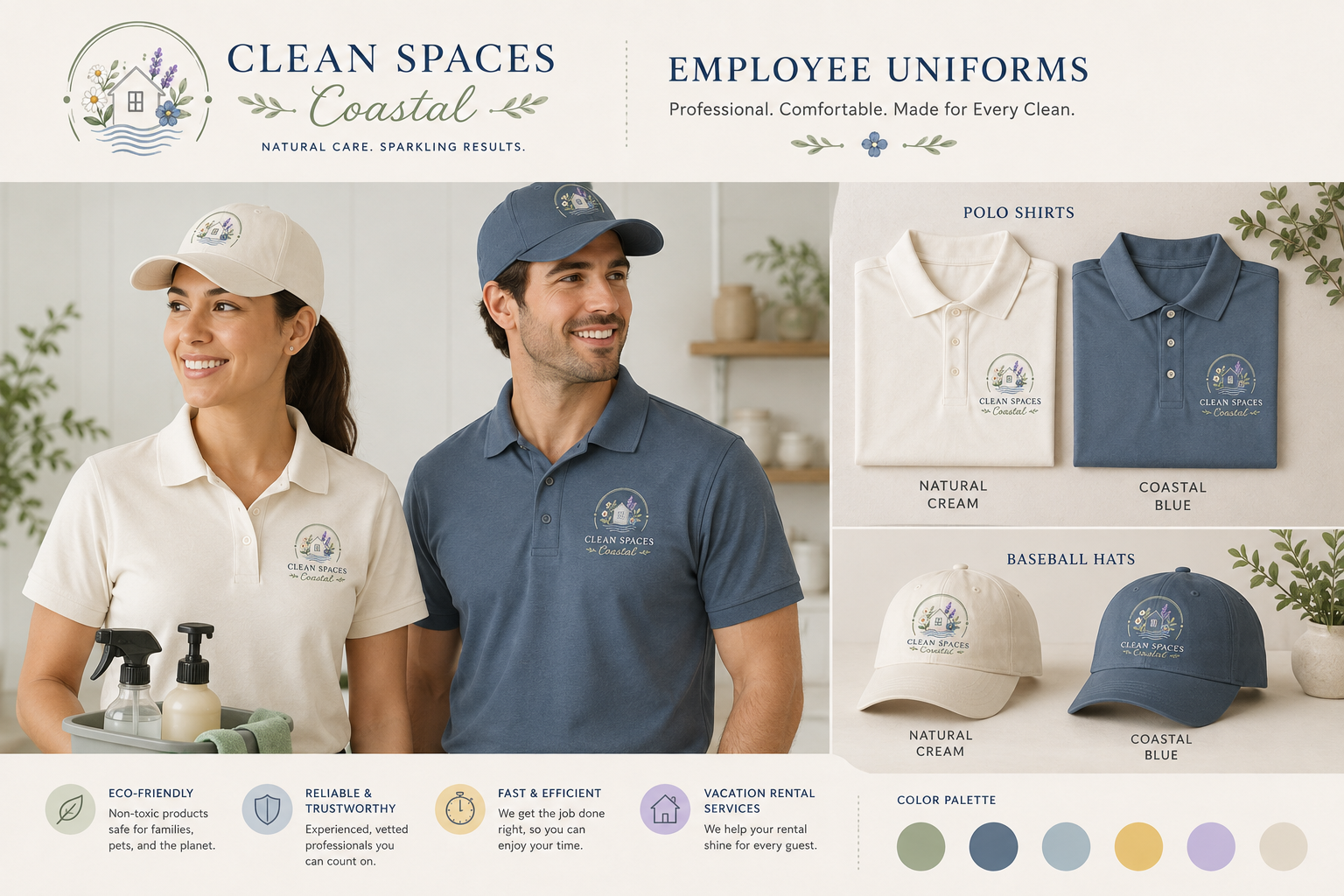
Clean Spaces Coastal employee polo shirts and caps
Employee uniform program: cream and coastal-blue polos and caps with the embroidered badge mark.
Brand DevelopmentMarketing CampaignsWebsites and Digital Projects

Clean Spaces Coastal Brand and Launch Kit

Complete brand and launch kit for a San Diego cleaning service offering non-toxic cleaning, vacation rental turnovers, and vetted, trustworthy personnel.

Objective

Give a local cleaning business one trustworthy, eco-minded look across web, print, and field uniforms.

Team role

Brand and project lead — identity, messaging, collateral, and rollout.

Responsibilities
  • Build the identity, badge mark, and watercolor illustration style
  • Write the service messaging and four core service pillars
  • Design the website layout, print collateral, and uniform program
  • Coordinate review rounds and print-ready handoff
Project-management approach
  • Locked four service pillars — non-toxic products, fast and efficient, vacation rental turnovers, reliable personnel — and repeated them in every channel
  • Set a sage, navy, and coastal-blue palette with Cormorant Garamond and Lato so print and web read as one brand
  • Produced door hangers and cards first so local canvassing could start before the site launched
Deliverables
  • Logo suite: primary lockup and house badge mark
  • Brand sheet with palette, typography, and service icons
  • Website design
  • Flyer, door hanger, and double-sided business card
  • Employee uniform program: polos and caps
Outcome

Launched with a consistent, eco-forward look from door hanger to website to uniform, plus reusable templates for ongoing local promotion.

Mangoes Boutique website homepage design
Full website design for Mangoes Boutique: hero, collections, brand story, and social feed in one ocean-inspired digital storefront.
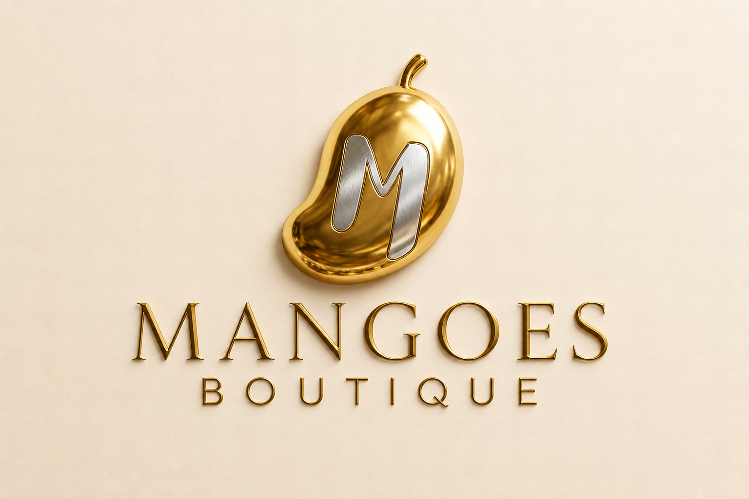
Mangoes Boutique gold mango logo mark with wordmark
Primary logo mark: a sculpted gold mango holding a brushed-silver M, paired with a classical wordmark.
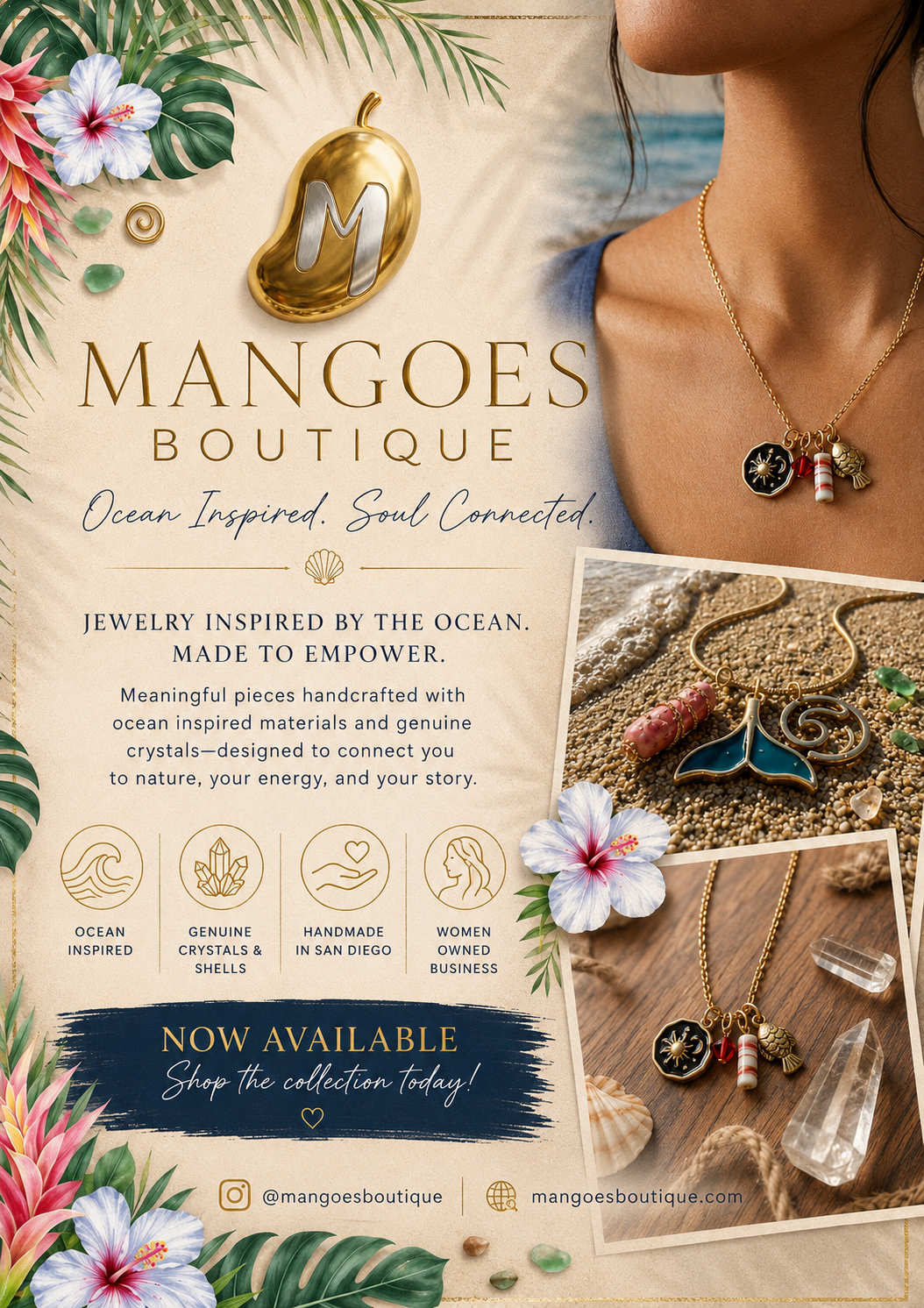
Mangoes Boutique launch flyer with jewelry photography and tropical botanicals
Launch flyer carrying the 'Ocean Inspired. Soul Connected.' line, product photography, and brand value icons.
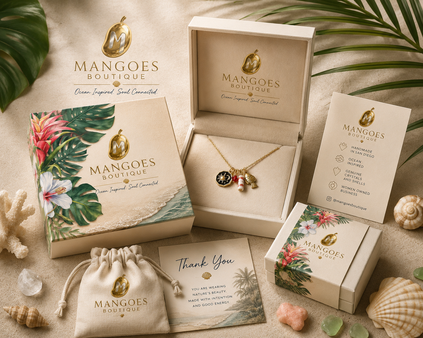
Mangoes Boutique packaging suite with jewelry box, pouch, and thank-you card
Packaging suite: box, pouch, thank-you card, and care instructions — designed as one unboxing experience.
Brand DevelopmentWebsites and Digital ProjectsMarketing Campaigns

Mangoes Boutique Brand and Launch

Built a handmade jewelry and clothing brand from scratch — the gold mango logo mark, an ocean-inspired brand story, launch print, and a launch-ready digital presence.

Objective

Turn a maker's collection into a coherent brand with a launch plan the owner could run alone.

Team role

Project lead — brand, content, and launch coordination.

Responsibilities
  • Define positioning, name treatment, and visual identity
  • Write product, launch, and flyer copy
  • Produce campaign and social assets
  • Run review rounds and final handoff
Project-management approach
  • Agreed a written brand brief before any design work
  • Sequenced launch backwards from the release date
  • Left reusable templates so the owner could keep posting
Deliverables
  • Logo mark, wordmark, and brand system
  • Packaging suite: boxes, pouch, and care card
  • Launch flyer for print and social
  • Product and launch copy
  • Social and email launch kit
Outcome

Launched with one consistent look across product, print, and social — and a template set the owner still uses.

Glossylove logo system with wave badge and frame icon
Identity system: wordmark, wave/sunset badge, and the subtle frame icon used on the temples.
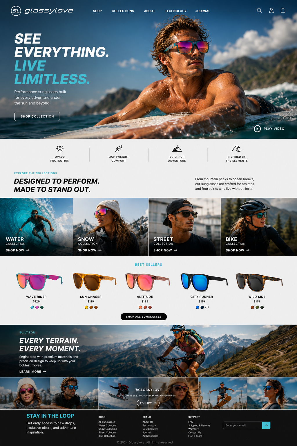
Glossylove homepage design
E-commerce homepage: hero campaign, product pillars, collection tiles, and best sellers.
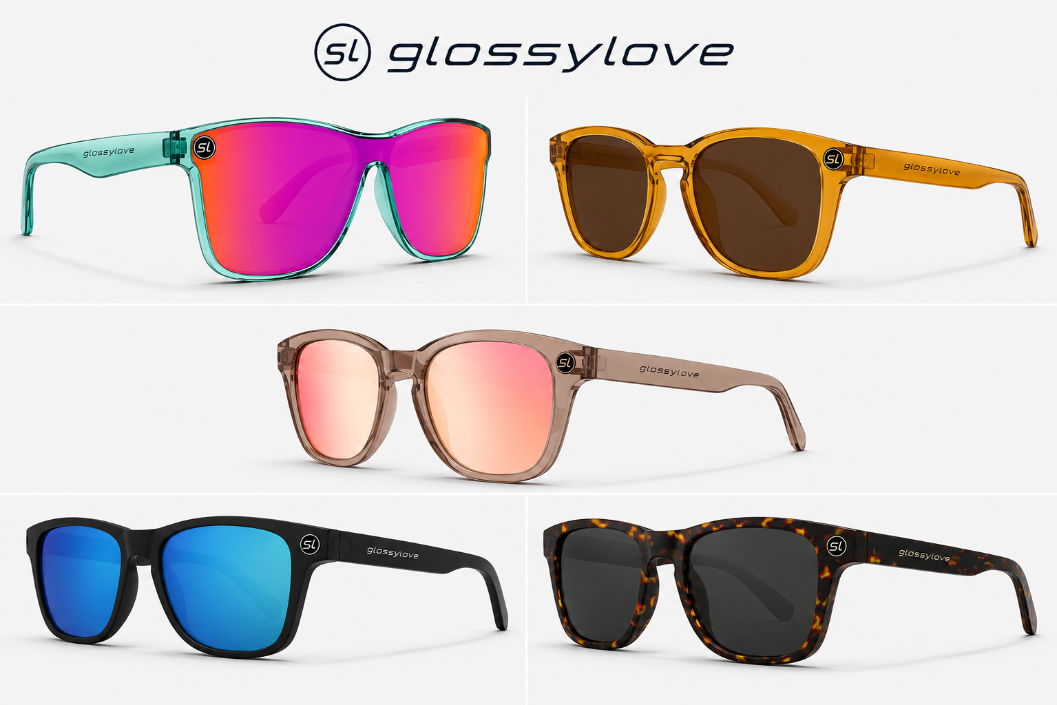
Five Glossylove sunglasses colorways
Product range shot to one standard so all five colorways sit in a single grid.
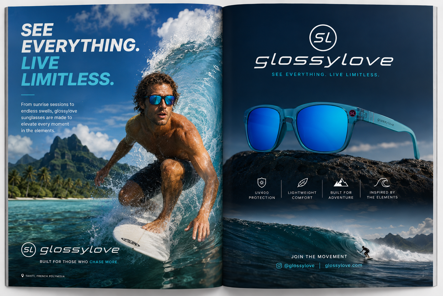
Glossylove magazine spread with surfer
Print campaign spread pairing the hero line with product and location storytelling.
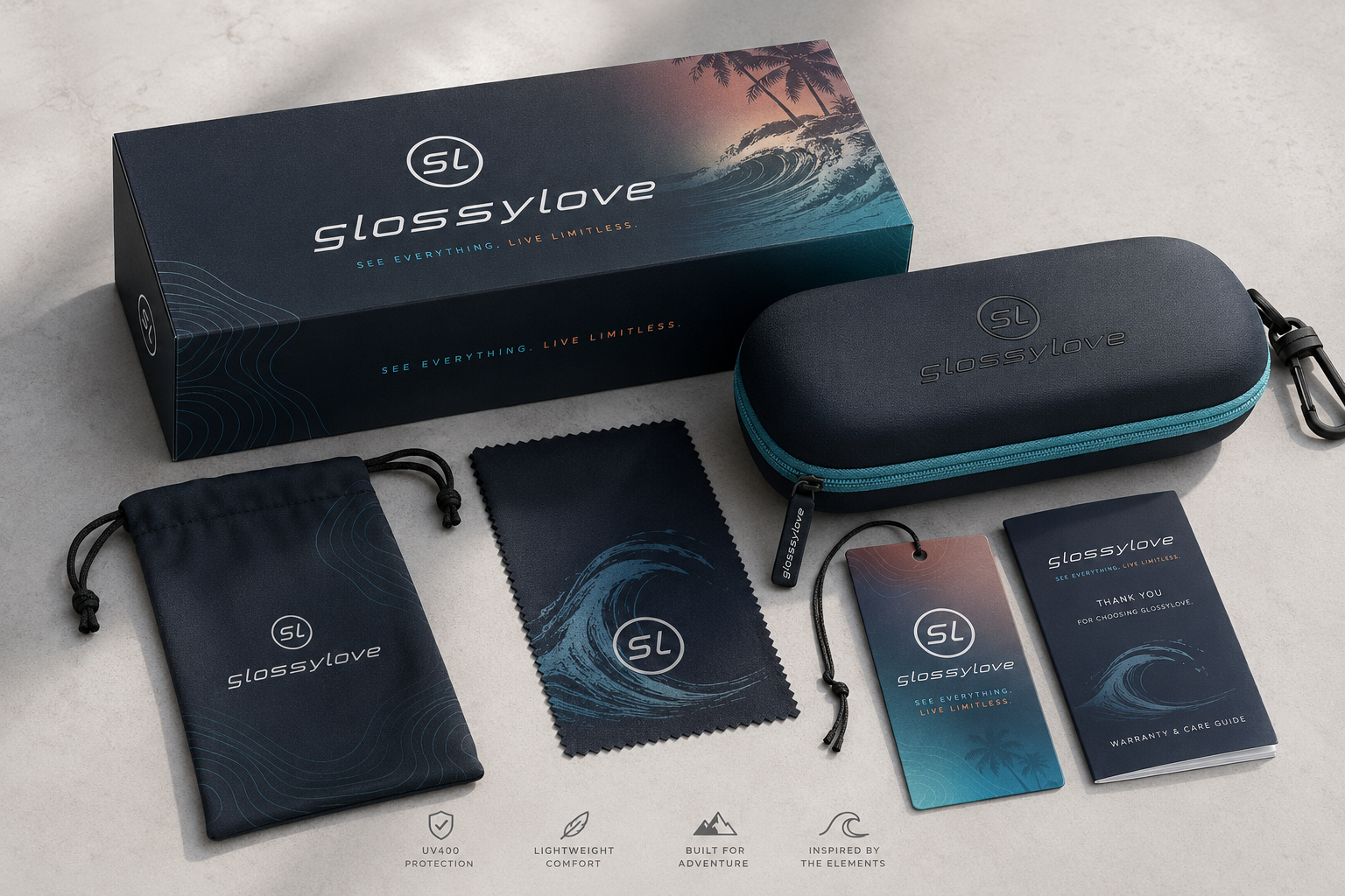
Glossylove packaging suite
Packaging suite: box, hard case, pouch, cloth, hangtag, and warranty guide.
Brand DevelopmentMarketing CampaignsWebsites and Digital Projects

Glossylove Performance Eyewear Brand Launch

Full brand and launch system for a performance sunglasses label built around the line “See everything. Live limitless.”

Objective

Launch a new eyewear brand with one consistent look across product, packaging, print advertising, and e-commerce.

Team role

Brand and project lead coordinating identity, product presentation, campaign, and web rollout.

Responsibilities
  • Build the identity: wordmark, SL monogram, wave/sunset badge, and subtle frame icon
  • Direct product photography and the four collection stories (Water, Snow, Street, Bike)
  • Coordinate packaging, case, pouch, cloth, hangtag, and warranty guide
  • Art-direct two-page magazine spreads and the homepage layout
Project-management approach
  • Set a single message hierarchy — headline, four product pillars, then proof — reused in every channel
  • Locked a deep-navy, ivory, and cyan palette so print and web read as one brand
  • Standardized frame photography so five colorways could ship as one grid
Deliverables
  • Brand identity and logo system
  • Product and collection photography direction
  • Retail packaging and unboxing suite
  • Print campaign spreads and homepage design
Outcome

The launch shipped with identity, packaging, campaign, and site aligned, giving the brand a reusable kit for new collections.

OhmX platform launch visual
Launch visual positioning OhmX within the Nabsys parent brand.
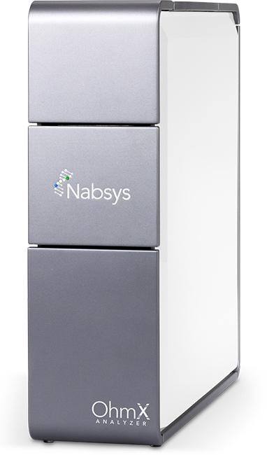
OhmX genome mapping instrument
Instrument photography coordinated for launch and sales use.
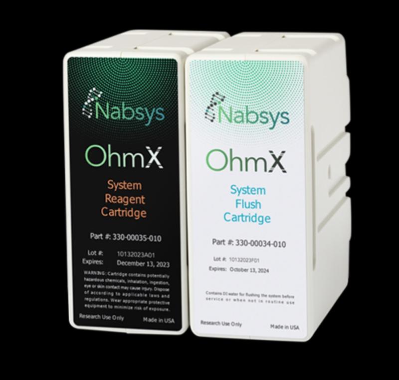
OhmX consumable cartridges
Consumables carrying the same identity across packaging.
Brand DevelopmentBiotech and HealthcareMarketing Campaigns

Sub-brand Design for OhmX, a Nabsys Instrument

Sub-brand and launch communications for OhmX, the electronic genome mapping platform from Nabsys, an established genomics instrumentation company.

Objective

Give the platform its own identity and launch package while staying clearly within the Nabsys parent brand, on a fixed release date.

Team role

Brand and launch coordinator between leadership, engineering, and production vendors.

Responsibilities
  • Run positioning sessions with leadership and technical leads
  • Maintain the launch timeline across identity, collateral, and web
  • Coordinate product photography and print vendors
  • Track approvals so every asset clears review before release
Project-management approach
  • A written positioning brief signed off before visual work started
  • Launch sequenced backwards from release, with named owners
  • One status tracker shared by engineering, marketing, and vendors
Deliverables
  • Sub-brand identity and visual system
  • Positioning and messaging framework
  • Launch collateral and consumables packaging direction
  • Web and presentation content
Outcome

The platform launched on schedule with one identity across instrument, consumables, print, and digital.

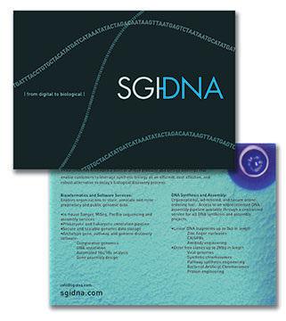
SGI-DNA brand identity system
Brand system built for scientific credibility across print and digital.
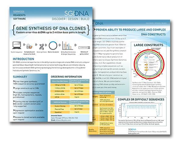
SGI-DNA product brochure spread
Technical product brochure — specifications translated for a commercial audience.
SGI-DNA trade show banner
Trade-show banner produced to the event's spec and deadline.
Biotech and HealthcareContent and CommunicationsBrand Development

Biotech Brand and Marketing Support

Ongoing marketing support for life-science organizations selling instrumentation, reagents, and diagnostics to scientific and clinical buyers.

Objective

Give technical and commercial teams one approved, regulation-ready set of materials that supports the whole sales cycle.

Team role

Marketing and communications coordinator across product, sales, and executive stakeholders.

Responsibilities
  • Turn scientist input into approved customer-facing copy
  • Run review cycles across marketing, sales, and regulatory
  • Keep brand consistency across print, digital, and presentations
  • Manage version control for distributed sales teams
  • Produce global sales reporting and CRM accuracy
Project-management approach
  • One intake path so priorities and due dates stayed visible
  • A fixed draft → review → approval → release sequence
  • A shared library of current-version assets only
  • Short recurring check-ins with sales
Deliverables
  • Product brochures and technical data sheets
  • Sales presentations and leave-behinds
  • Campaign and email assets
  • Trade-show graphics and booth materials
  • Global sales reports
Outcome

Materials shipped on predictable timelines with fewer revision rounds, and sales worked from a single approved asset set.

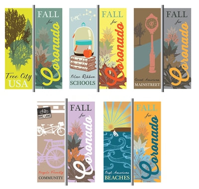
City of Coronado street banner program
Citywide banner program — produced to municipal install specs and dates.
Marketing CampaignsCreative Operations

City of Coronado Promotional Banner Campaign

A commissioned set of street banners highlighting Coronado's main strengths — installed along city corridors to promote the destination and civic identity.

Objective

Create a cohesive banner series that showcases Coronado's key attractions and community character for public display.

Team role

Design and project coordination — concept, layout, production specs, and city approval.

Responsibilities
  • Develop banner concepts around Coronado's main strengths
  • Design layouts to municipal specs and install requirements
  • Coordinate review with city staff
  • Prepare print-ready files for large-format production
Project-management approach
  • Started with the city's key messages and visual standards
  • Built one flexible template that scaled across banner sizes
  • Confirmed install specs before finalizing artwork
Deliverables
  • Street banner series
  • Production-ready files
  • Municipal spec sheets
Outcome

A unified banner program installed citywide, promoting Coronado's strengths with one consistent look.

Coronado Island Film Festival primary logo
Primary logo identity created for the inaugural Coronado Island Film Festival.
Brand DevelopmentEvents and Trade ShowsMarketing Campaigns

Coronado Island Film Festival Identity

Primary identity for the launch of the Coronado Island Film Festival, the first event of its kind in the city. Created in partnership with the organizing committee.

Objective

Give the inaugural festival a distinctive, memorable logo that could carry the event across print, signage, and digital channels.

Team role

Logo designer — concept through final identity.

Responsibilities
  • Develop the festival logo from initial concept to final artwork
  • Partner with the organizing committee to align the identity with the event vision
  • Prepare final identity files for print, signage, and digital use
Project-management approach
  • Started with the festival's mission and Coronado's community character
  • Explored directions that felt cinematic and locally rooted
  • Refined one concept into a flexible mark for every application
Deliverables
  • Primary festival logo
  • Print and digital identity files
  • Brand usage guidance
Outcome

The festival launched with a clear, owned identity that could be applied across posters, programs, signage, and digital channels.

Filipino Village National City identity mark
Neighborhood identity built to carry across environmental signage.
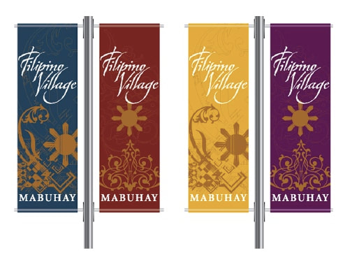
Filipino Village street banner series
Street banner series delivered to a fixed public install date.
Brand DevelopmentMarketing CampaignsCreative Operations

Filipino Village Neighborhood Rebrand

Pro bono rebrand of the Filipino Village neighborhood in National City, CA — identity through large-format environmental signage.

Objective

Give the neighborhood a recognizable identity visible in the streetscape, on a donated budget.

Team role

Design and coordination — identity, environmental design, and print coordination, delivered pro bono.

Responsibilities
  • Design the neighborhood identity and street banner series
  • Coordinate print specs, quantities, and install dates
  • Adapt one concept across signage and print
  • Collect approvals from community organizers and city contacts
Project-management approach
  • Locked install and print deadlines before starting design
  • Built one flexible layout that scaled from print to street banner
  • Kept the cultural motifs specific rather than generic
Deliverables
  • Neighborhood identity and logo
  • Street banner series and environmental signage
  • Print promotion set
Outcome

The neighborhood gained a consistent visual identity in its streetscape, reused by organizers in later years.

Awesome Artist identity mark
Identity mark for a K–12 art school in Coronado, CA.
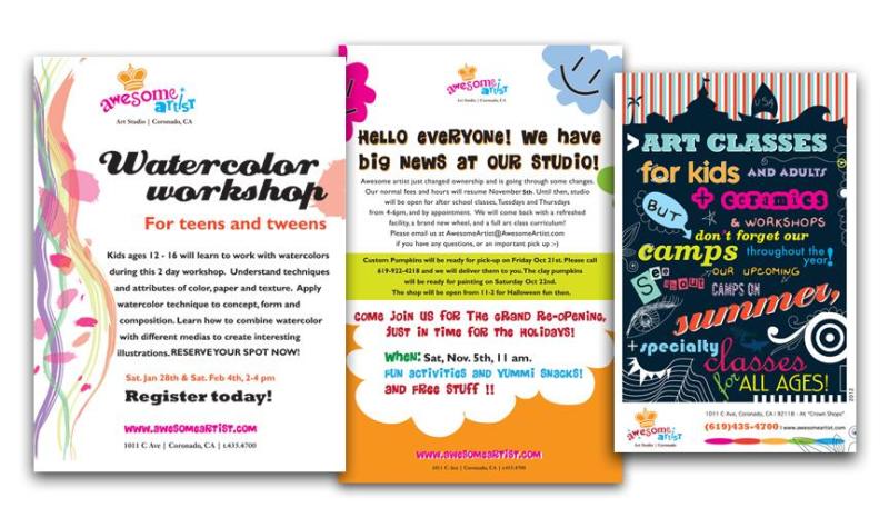
Awesome Artist marketing collateral
Collateral developed from the agreed content plan.
Brand DevelopmentContent and CommunicationsMarketing Campaigns

Awesome Artist Identity and Collateral

Identity and collateral for an art school for kids K–12 in Coronado, CA.

Objective

Give the school one recognizable identity across enrollment, class, and event materials.

Team role

Project lead — planning, content, creative coordination, delivery.

Responsibilities
  • Develop the identity and apply it across collateral
  • Organize messaging for parents and prospective students
  • Write and produce enrollment and program materials
  • Manage review rounds and sign-off
Project-management approach
  • A written content plan before any layout
  • Review checkpoints at plan, draft, and pre-print
  • A deliverable tracker visible to the client throughout
Deliverables
  • Identity and logo
  • Enrollment and program collateral
  • Campaign visual assets
Outcome

The school presented one coherent look across every parent-facing material.

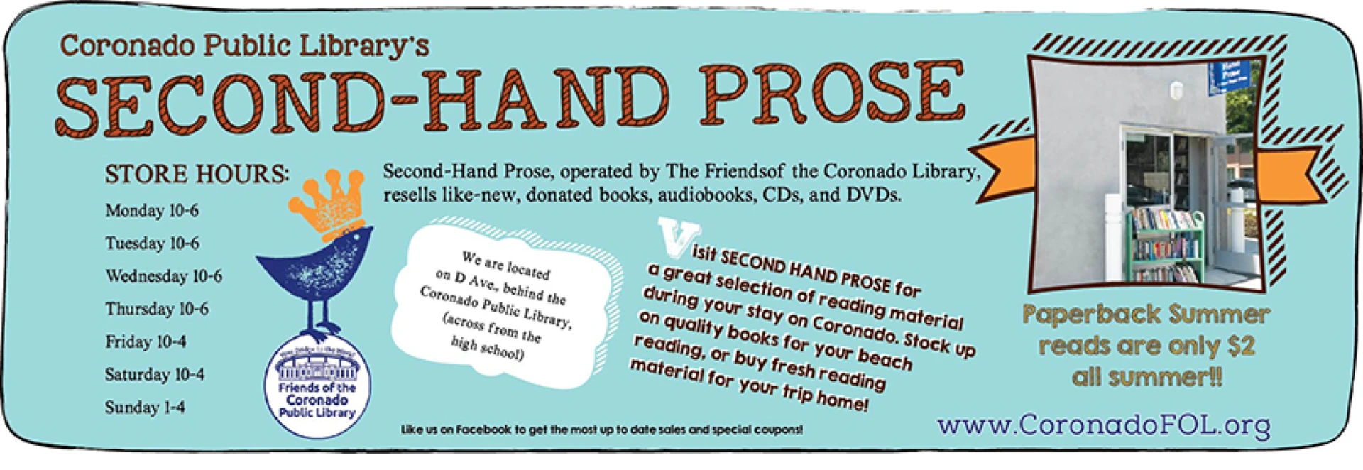
Second-Hand Prose bus signage
Second-Hand Prose bus signage — the campaign's largest-format placement.
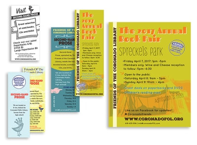
Book fair collateral campaign materials
Book fair collateral campaign — same message carried over from the bus signage.
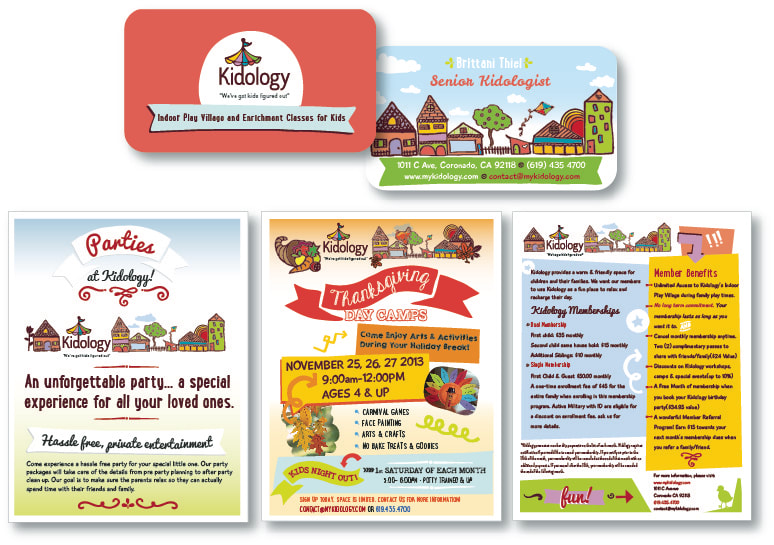
Kidology children's education center branding
Program identity for a children's education center.
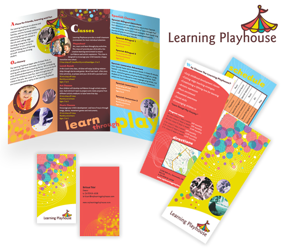
Learning Playhouse program materials
Early-education program materials built for volunteer reuse.
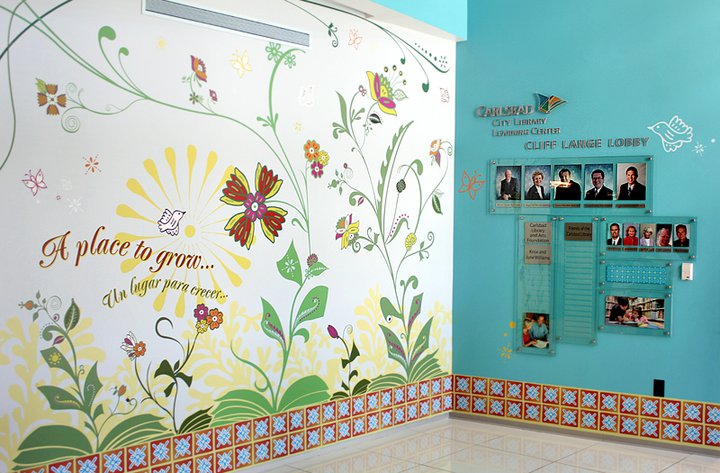
A Place to Grow mural at Carlsbad Learning Center
Environmental artwork coordinated with facility staff and installers.
Marketing CampaignsContent and CommunicationsCreative Operations

Community and Educational Campaign

Awareness and attendance campaigns for nonprofit retail, children's education, and community arts programs run by volunteers.

Objective

Grow attendance for public programs on small budgets and short lead times.

Team role

Interim designer and creative direction.

Responsibilities
  • Plan timelines around program dates and volunteer availability
  • Coordinate messaging across print, signage, social, and email
  • Gather content and approvals from staff and volunteers
  • Adapt one campaign concept across every format
Project-management approach
  • One message per program, adapted per channel rather than rewritten
  • Simple templates volunteers could reuse without a designer
  • Communications in waves — announce, remind, final call
Deliverables
  • Event campaign identities
  • Print advertising, flyers, and signage
  • Social and email announcement sets
  • Environmental and mural artwork
Outcome

Programs reached their communities with recognizable materials, and staff kept templates for future cycles.

Want the detail behind any of these projects?

I'm happy to walk through timelines, stakeholder structures, and how each project was managed to completion.

Start a Conversation